
Oh, hey.
At the beginning of the year, I thought I’d take some time out from focussing completely on work. I wanted to try doing some creative projects in my spare time again.
Unfortunately, this hasn’t happened the way I wanted it to. Work has been ever-present in my life and as usual, I’ve pushed personal pursuits on to the back burner again. The two projects I wanted to complete this year have stalled. I’ve made very little progress on both of them to date. My artworks have also taken a hit: I haven’t been able to draw anything I want to share for a year now.
It’s not all doom and gloom, though. While work may be busy, the team and I are making a lot of progress and we’re getting results. But that’s not what I want to write about today.
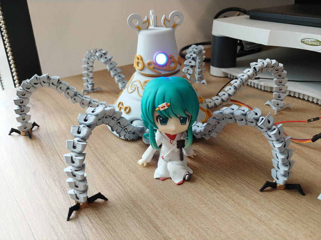
I still want to work on something interesting in my spare time. With my limited capacity, I’ve started a tiny modelling project with the help of my 3D printer. The project is to recreate one of the characters from the latest Legend of Zelda game: a Sheikah Guardian. I’ve decided to make the software and hardware open-source. You can find the code on my GitHub account. I’ll write a full outline of the project, including build steps, over the next few days. Until then, here is a photo of it on my desk, guarding my Miku Nendoroid.
Tiny update
The last few months at work have been exceedingly busy as I’ve raced to finish my on-job training as well as working on my day job and preparing to take on a new set of responsibilities.
If I survive, I’ll try and draw something new.
The 2016 retrospective
As with last year, I’m taking this opportunity to look back upon all that I’ve achieved over the past twelve months. I won’t go into monthly detail on what I’ve done this year: so much has happened, and besides, the beginning of 2016 feels so long ago now that I honestly cannot accurately remember what I was doing for the first part of the year.
The most significant change for me this year was back in April when I was moved to the web apps team due to budget cuts at the company I am working at. This has allowed me to use my more artistic side in my daily job with the knock-on side effect of reducing my motivation to do any work on my personal artistic projects in my free time. The team has struggled to work on getting a product out the door before the end of the year whilst staying within budget–and, to be completely honest with you, for most of the year it didn’t seem as if we would make it. Fortunately, in the fortnight leading up to Christmas, things finally started coming together.
I’ve come a long way over the course of the year. Despite changes and stress from work, I’ve continued to improve myself and my non-work skill set. In 2015 I was able to improve my outlook after a few years down in the dumps, and I’ve definitely done my best to continue in that direction through 2016. I’ve also managed to finish the year with quite a significant positive bank balance in my everyday account (even after getting presents and the like for Christmas) which, while unexpected at first, is definite proof that my finances are in a much better shape this year than they have been.
At the beginning of the year, I challenged myself to complete at least twelve artworks, limiting the work on every image to a month. I tried my best to keep to this schedule, drawing a vector character image for eleven months. June was a no-show as I didn’t finish it in time due to work deadlines and then going on holiday. I’ve been told the quality of my art has improved over the year, and I find that’s reflected when you compare the images side-by-side.

Most of these images have a long tale accompanying them depicting what I like best and what I learnt while drawing them: I’ll let you read those in your spare time by viewing the full-sized images in my gallery. As a summary, I’ve spent a lot of time focusing on lighting and realistic shapes leading to what I think are some of my best works to date.
I’ve picked up a few new skills this year, most of which are work-related. A few of them have spilled over to my hobbies: my website being a prime example. I rewrote the ageing PHP-based website in May, and then dropped that completely in favour of a faster Angular 2.0 site in November. If most of those words didn’t make sense to you, that’s fine: I basically advanced the site’s code about ten years by using more modern technologies.
2017 looks like it’s going to be an interesting year. I can’t even hazard a guess as to what’s going to happen this coming year. My office is moving as I write this to a new location about fifteen minutes drive from my flat. It’s amusing that this is one of the few years in my life where I haven’t moved where I live, but where I work instead. As I correctly estimated last year, I wasn’t able to complete my three-year training course in 2016, but I’m in a far better position to do so in 2017.
The world also seems in an odd shape starting out the New Year. With Brexit on the horizon and a new American president looming, there’s definitely going to be some change from what we’re used to. But time is a gift and the present is truly a present–so whatever happens, we should try and make the most of it.
The Journey
It’s been a few weeks since I completed my artwork for September, The Journey. I know at the time I said I’d write a journal post about how I’d put it all together, but with pressure at work and a tough time at home I let this slip somewhat. I have, however, wanted to write this and have made a few notes here and there which I think I can cobble together as a coherent journal post now.

The Journey is one of those pieces I’ve truly gone out of my way to make something special. When I started it I didn’t intend for it to end up as epic as it did, it’s only after I’d restarted the image twice and spent a significant amount of time on it that I realised I wanted it to stand out and be something special. In total, I spent about 3 hours a day for 21 days working on it, and I’m very happy indeed with the way it’s turned out.
When I started, the image was supposed to be a “cutesy” image of a boy and a girl on a couch in the afternoon sunlight—as a matter of fact, the file name is “couch.svg” which is somewhat telling. Of course, they couldn’t just be sitting down: that would be too boring. I experimented with making them do things like reading or playing video games together, but nothing really stood out as interesting. I also toyed with them sitting at opposite ends as if they’d just had an argument, but the image started to lose its appeal when I did that.
After a few “ideations” on this design, I decided it would be a more touching image if the couple were being a bit more intimate—but after August’s image, I didn’t want to get too intimate. It was therefore a pretty obvious choice to have them asleep on each other’s shoulders, which led to the pose that you see in the final image. The location changed quite a few times in the first “sketches” (if that’s what you call the scratchy lines I drew in Inkscape) before I settled on the train carriage.
Train journeys have been one of those things that I’ve been doing for a large portion of my life. I’m one of those people who will end up taking a metro over equivalent transportation—I feel at home on the London Underground or the Singapore MRT, for instance. Placing the scene in a train carriage just reverberated with me and that was the reason why I could shamelessly slot myself into this picture along with “best girl lel”.
The carriage itself draws on inspiration from my time in Asia. Here in the UK, train carriages generally tend to have seats facing the front and back of the carriage, so you face the direction the train is going, or find yourself moving backwards. However, in countries like Singapore and Japan, the train seats in their commuter trains tend to be along the sides of the carriage. I think the decision of drawing the train this way is probably because I wanted to show scenery in the background. Since it’s been a year since my trip to Japan, I decided that it would be nice to commemorate it by drawing a train in the style of a Tokyo or Kyoto commuter train.
I’ll admit I didn’t think much about the backdrop outside the train carriage to start with. I drew a very simple backdrop at first: some trees and basic, uncoloured telegraph pylons and released a “work in progress” to my friends, who instantly commented that the overall picture had a distinct Japanese flair to it. Since I was already pulling ideas from my time in Asia, it wasn’t hard to take inspiration for the scenery from there too. The scenery is actually more based off the area of Thailand where my mother was born: the telegraph pole streetlamps I’ve drawn are actually based on streetlamps around my parents’ house.
I know I’ve been concentrating on Paige a lot recently in terms of characters used. I’ve not hidden the fact that she’s my idea of “the perfect girl” and I guess I have been a bit obsessed with getting her looking right over the course of this last year. In the original comics I drew, I hinted at her being close to my character. In the Reboot of these comics, I hinted at that no longer being the case. I’ve never actually confirmed this connection, so I guess you can now take this as the official canon version of events that there’s a connection there. That said, I am going to shift the focus off her for a bit: it’s getting a little repetitive drawing her every time and I’m pretty sure she’s a bit sick of the limelight right now 
The rest is the same story as usual. I’ve concentrated a lot on lighting in this picture, and I think it’s paid off. Admittedly I haven’t mixed the lighting from inside and outside the carriage, so the afternoon sun isn’t casting shadows, but I’ve tried to make everything inside the carriage appear lit from the ceiling lighting. I also put more emphasis on lighting on clothes, which is something I’ve already started using in October’s image. I also brought forward some of the new learning I picked up in previous months—most notably the lighting on faces and hair, and some smaller things like Paige’s fringes being semi-transparent where the hair is thinner.
There are parts that I’m not entirely happy with. For example, I’m still trying to get clouds looking decent—the current style I’m using is slightly too hard-edged. Also, the more I look at it, the more I’m starting to think the scenery is a little too small and may have been better if it filled more of the window. Fortunately, most of the annoyances are minor and don’t detract too much from the overall composition.
I’ve already completed October’s image at time of writing this—and it’s already used a lot of the things I’ve learnt from The Journey, even though it’s a significantly more simple image than this one. As always, it’s a learning process and is definitely helping me improve overall.
Drawing lines
I was rather hesitant to upload it to start off with: in the past when I've drawn my characters, I've tried to keep the artwork “pure” – that is to say, suitable for viewing with a general audience. This image makes a departure from that somewhat being a summer beach scene so there is some exposed skin and midriffs – I thought I'd try and rough up the status quo anyway

It's definitely one of the more realistic images I've drawn recently as I took a lot of time trying to get shapes right, as opposed to covering up bad lines with layers upon layers of clothes. It uses a lot of new skills I've learnt this year, including a lot of the techniques I learnt while drawing the realistic Paige image. I've spoken about this point before, but you've probably noticed that some of my earlier images seemed to have unrealistic proportions compared to their outfits. This is probably because I tried to get the outfits to work first, and then just crammed in the body parts around them as an afterthought. I started trying to move away from that last year with the images I drew in Japan, along with the belated birthday card, and I think the image I drew in July's (The Little Rocket) is the first one where I worked with proper body shape guidelines taken from a posed (plastic) figure as opposed to just trying and seeing what I got. This image continues this ongoing improvement by, well, reducing the number of clothes I drew altogether.
It's also one of the few images I've drawn which has completely divided my group of friends: some have praised it for being different from my usual images; others have gone as far as telling me off for offering “fanservice” for the wrong masses, and that images like this shouldn't exist. Personally, I'm not sure which side of the line I'm on: when I started off it was a fun challenge but made me feel a bit uncomfortable; now that I've completed it I'm quite happy with it because I can see that my art style is improving somewhat. That said, I've always viewed Paige as “the perfect girl” and somewhere inside of my subconscious I still feel a bit uncomfortable sharing a picture of her in just a bikini – so much so, I put her in a sarong as well and invited Sandy to stand awkwardly in the sea in the distance. Seriously though, if I were to do more work on this image, I think I'd change Sandy's pose first – It's really unnatural.
Since this image makes some people feel uncomfortable, so I've marked it as mature content.

While I'm happy with that image (apart from Sandy's pose), the artist in me is never happy with a finished image. There's always something major that can be improved – and that's what I originally wanted to write this post about.
Occasionally I find anime/manga pictures on DeviantArt which are also vector graphics similar to my works. However, there's been a few times where these images don't have the hard edge lines around characters and I've always thought they really stand out in terms of looks. My character art style has relied heavily on edge lines to give characters form and definition, but I've been trying to reduce how obvious lines are. A few years ago I used black outlines for everything which looked a bit surreal; over the last year I've been concentrating on using line colours that more match the colour of the object being drawn. It makes them less obvious, but they're still there.
Of course, I decided that I wanted to try an image which didn't have any outlines in it whatsoever – so why not the one I'd just finished drawing?
Over the last few days, I've taken some time to remove all of the edge outlines from the image completely, while redoing bits that needed lines to show variances. I was genuinely surprised at the amount this changed the image, making it look a lot less ‘cartoony’. Unfortunately, it also made my lack of colour gradients in some areas a lot more obvious – especially on the arms which now seem to just blend in with the sky.

While I quite like the look, I'm not sure if I'm yet able to make the jump to a completely line-less art style. I'll keep it in mind, though – I'm pretty sure it will eventually get incorporated into my works, mainly because I've put time and effort into it now